The Thesis | What We're Arguing
In historical K-dramas, Hanbok costuming is never merely decorative; the meticulous application of Korea's traditional five-color system, Obangsaek, operates as a profound narrative engine that instantly codifies social stratification, foreshadows political ruin, and charts emotional transformation long before a character speaks a line of dialogue.
The Context | Why This Matters
Rooted in yin-yang and five-element philosophies, the Obangsaek (오방색) system aligns five specific colors with the cardinal directions and natural elements: Yellow (Center/Earth), Red (South/Fire), Blue/Green (East/Wood), White (West/Metal), and Black (North/Water). For centuries, this framework dictated strict social boundaries in Joseon-era dress, legally forbidding commoners from wearing royal hues like yellow and rich red, while designating white for the masses. Sageuks leverage this historical literacy to build instantaneous visual hierarchies for the viewer.
The Counter | Steelman the Other Side
Skeptics might argue that costume design in modern television is driven entirely by high-definition aesthetics, lighting constraints, and contemporary fashion trends rather than historical color theory. It is true that directors often prioritize color harmony on screen, sometimes selecting palettes purely to complement an actor's skin tone or to contrast against a specific set design. However, even when a production introduces modern pastel variations, the underlying logic of the hierarchy remains intact—retaining the foundational contrast between the rich, saturated tones of the elite and the muted, simpler palettes of lower-status characters to keep the storytelling coherent.
The Verdict | So What
Ultimately, analyzing the Hanbok color code reveals that costume design in sageuks functions as a living text rather than passive set dressing. It bridges historical reality with cinematic romanticism, demonstrating how a rigid, centuries-old class system can be translated into dynamic visual storytelling. By learning to read these garments, the viewer moves beyond surface-level aesthetics to witness the silent, ongoing battle for power, survival, and legacy written directly into the fabric.
The Evidence 1
The rigid deployment of primary Obangsaek colors provides an immediate baseline for royal authority and institutional identity. In The Red Sleeve, the title explicitly references the crimson sleeve cuffs worn by court ladies, acting as a permanent visual brand marking them as the king's property. The male protagonist, Yi San, alternates strictly between authoritative deep reds and scholarly blues, using the color code to visually anchor his legitimate right to the throne amidst court factionalism.
The Evidence 2
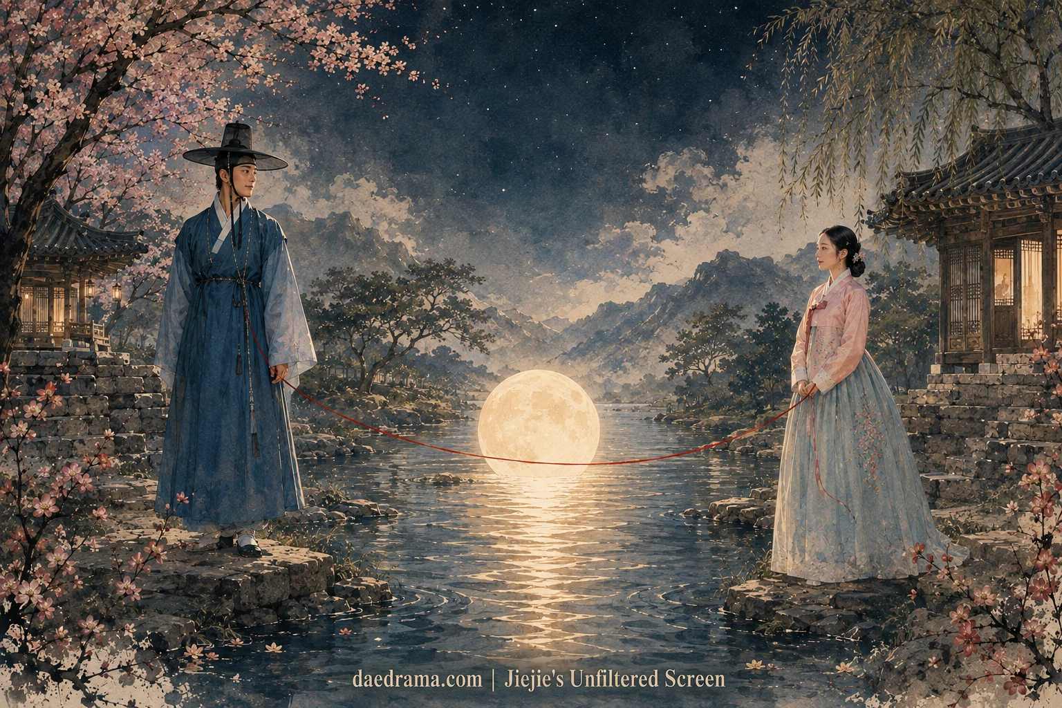
Modern historical dramas frequently exercise deliberate artistic license, introducing non-traditional shades like lavender, deep purple, and dusty pastels to convey psychological nuances. A scheming royal concubine seeking power may be dressed in saturated purples—a hue historically more expensive and exclusive than red—to signify her dangerous ambition and illicit desire to transcend her station. Conversely, romantic leads are often styled in mint greens and soft pinks to evoke purity and innocence for contemporary audiences, purposefully deviating from the rough, un-dyed fabrics historically mandated for their actual social class.
The Evidence 3
The deepest narrative utility of the Hanbok occurs during sudden palette shifts, which act as a visual shorthand for complete destiny upheavals and hidden identities. A disgraced prime minister stripped of his official insignia is abruptly thrust into the plain white cotton of a commoner, symbolizing social death and mourning. Conversely, a low-ranking palace maid who catches the king's eye undergoes an immediate, dramatic transformation into vibrant, embroidered silks—a jarring color transition that alerts the viewer to a permanent shift in the court's power dynamics.